Joy Pet Food
Telling a Healthy, Happy Tail
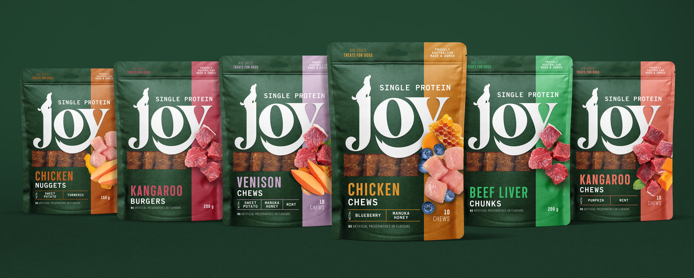
We were tasked with creating a new brand and packaging design for a premium Australian pet food product. Our goal was to create a brand that was approachable and friendly while also communicating the quality and premium nature of the product.
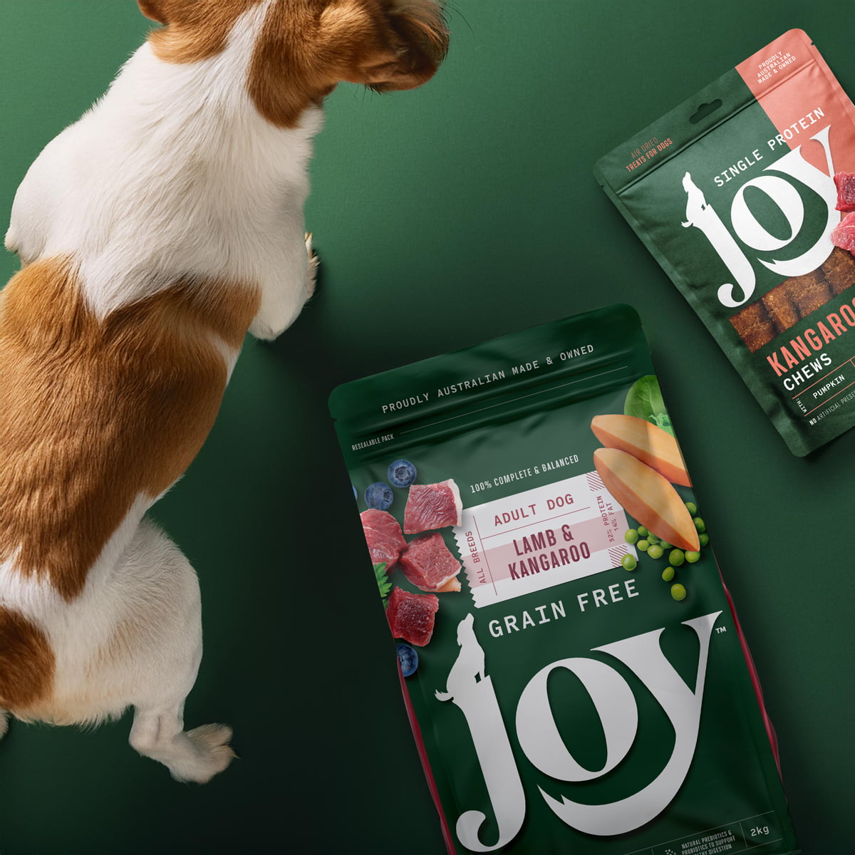
The centrepiece of the brand is a wordmark, crafted from lowercase letterforms with playful movement throughout. The wagging tail on the letter ‘y’ embraces the ‘o’ in a playful and charming way, while the tittle above the ‘j’ changes and adapts across different product ranges.
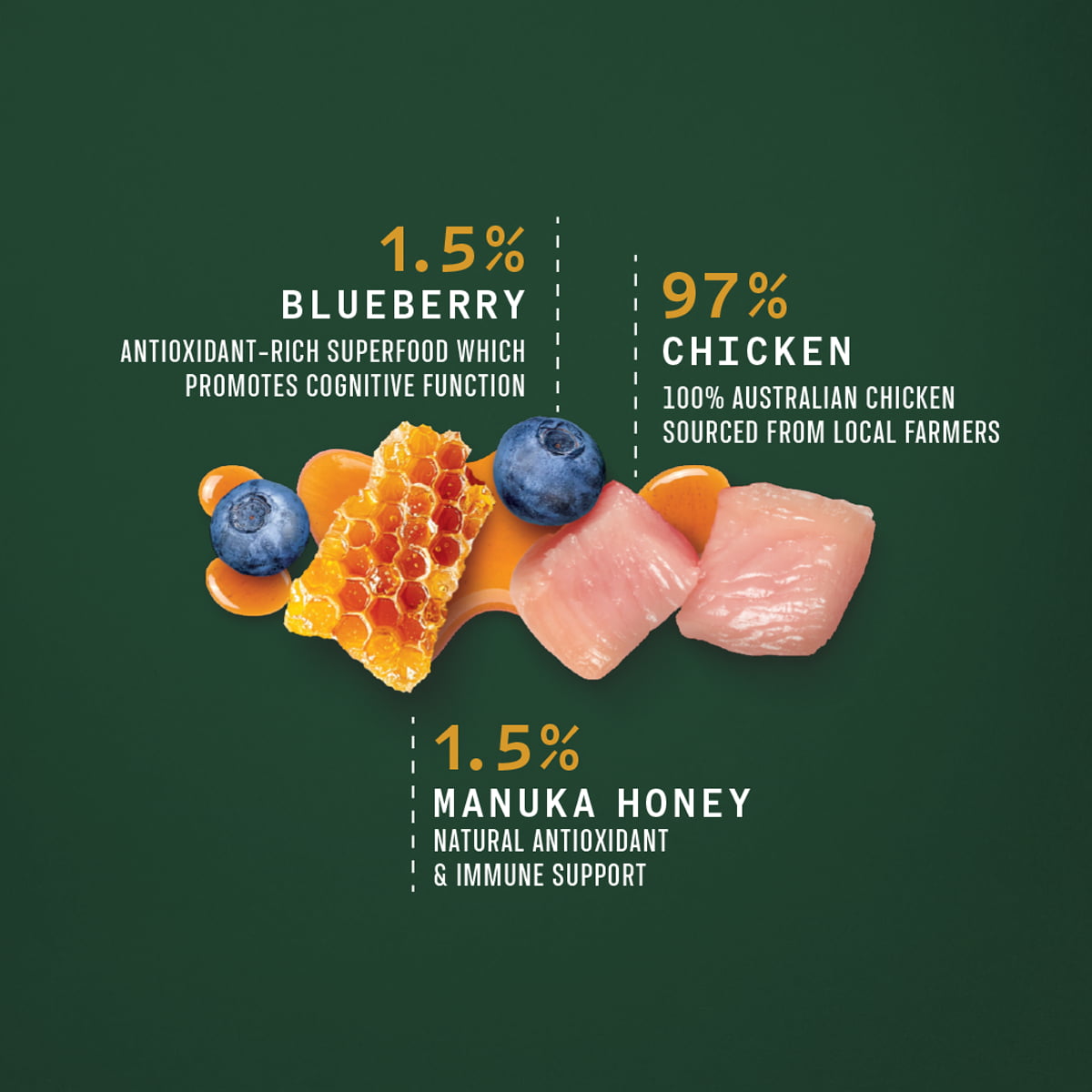
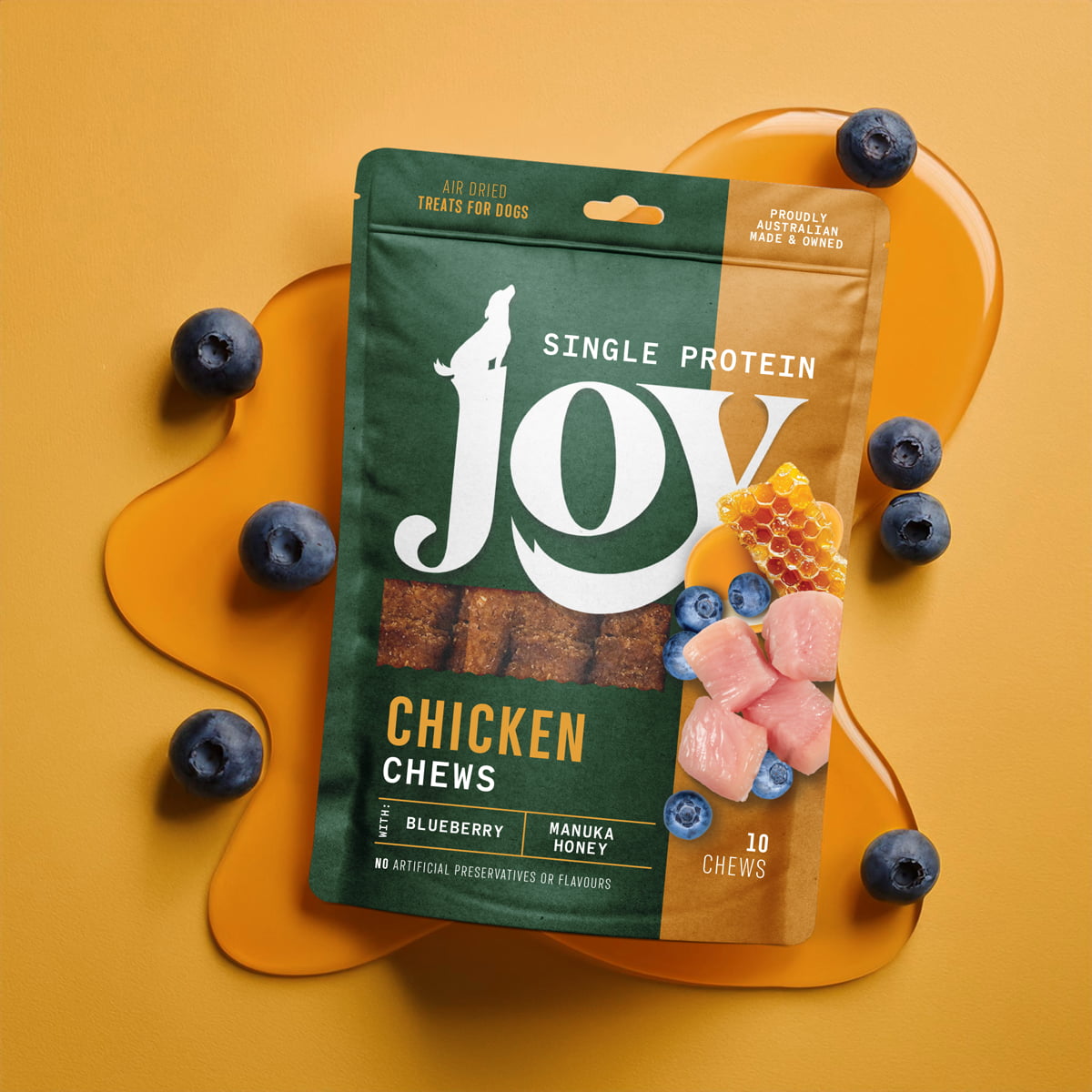
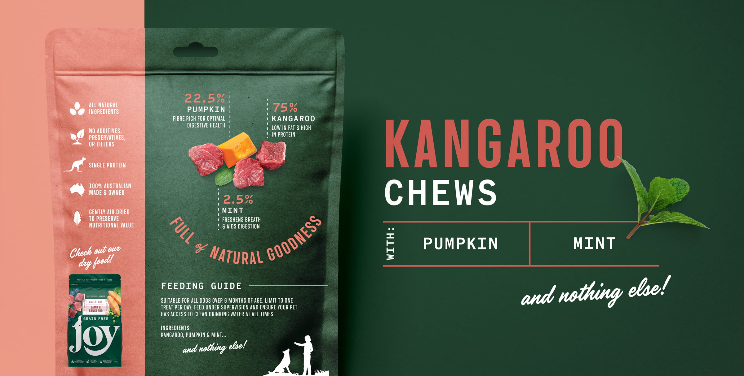
Having spent time observing the in-store environment, we noticed that the top of the packaging often got obscured by shelves or by the bag crumpling, so we strategically positioned the wordmark towards the base, making it impossible to miss. Its three-letter simplicity allows it to be dialled right up in size, making a brand that’s impossible to either miss or forget. To achieve further stand-out in the sea of white and black packs, we selected green as the key colour, to imbue our brand with nature and freshness. The overall design is sleek, modern, and simple, without any clutter so that the real-food photography we adorned the pack with could stand up and get counted.
The brand strikes a balance between sophistication and fun, giving the design a premium yet relaxed vibe. The result is a brand and packaging that will make you stop and take note, whether you’re in a store or browsing online.
More info: Contact us
“Boxer & Co. brought the Joy Pet Food brand and logo to life! They did an outstanding job developing a brand and logo that truly stood out in a really competitive category. The whole process was seamless and their team was incredibly easy to work with. We highly recommend them and look forward to working with them in the future!”
Brand Manager – Joy Pet Food


